Journal Entry #7: Industrial Design
I think the aesthetics part of the design process (generally called industrial design) is usually one of the first steps, before most of the math and engineering stuff happens. I obviously didn’t do things in that order, presumably because I wanted to see if the idea was feasible before spending time optimizing for aesthetics. In reality I just got excited and wanted to play with some sensors and motors (some of which I have in hand and will be writing about soon!).
Now we’re at the point where I know enough about the system to make a more true-to-form prototype. I’d like to be able to start testing the mechanical and electrical system together in a way that will show me any issues the final device might have, so this is a perfect opportunity to spend some time designing what that final device will look like.
This entry will start with a summary of the requirements we’ve already determined for the shape and size and other industrial-design-related things. I’ll also go through a quick mood board to show the vibe I’m going for, and then we’ll get into sketches and finally some basic 3D design. We’re just trying to get the shapes and ‘feeling’ of the design more ironed out, and then everything will be refined as we get more into the actual engineering design later on.
Requirements and Design Goals
The biggest benefit of doing all the math and preparation in the previous entries is we already have a list of requirements to design around. They are:
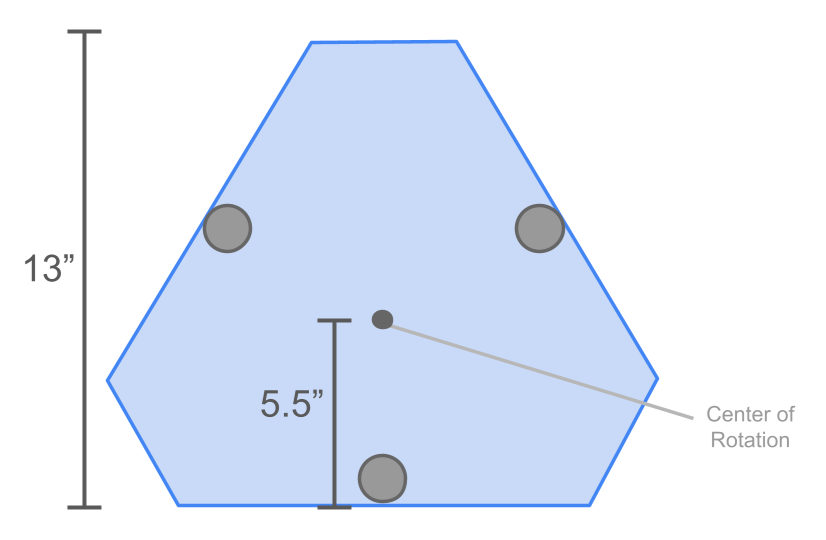
Overall shape defined in the image below (13” edge-edge and 5.5” edge-center)
Three feet with location defined in the image
28mm minimum internal height to fit the motors
Two moving ‘lifters’ in two of the corners of the triangle, each able to move up and down 10mm. These are the pitch and yaw axes.
Potentially an aesthetically-matching third lifter in the final corner that would remain stationary as a pivot point.
The entire triangular assembly needs to rotate in relation to the three stationary feet.
For stability, the top surface that the telescope sits on should be as low to the ground as possible. So the assembly as a whole should be as thin as possible.
There are some other not-as-concrete requirements I’ve also decided upon:
The structure should be made primarily of sheet metal. All the precision and error math we’ve done won’t mean anything if the structure isn’t rigid, so we’ll be avoiding 3D printed or thin plastic parts wherever possible. Sheet metal is also super easy to source and cheap to manufacture, and can be powder coated with any number of colors or finishes.
The three legs should be easily replaceable. I want to have the option to switch between rubber feet and spiky metal ‘stakes’ for feet to push down into soft ground for more stability.
I want to include a top ‘stability panel’ that lays on top of the three lifters. This would be the flat surface the telescope would sit on, and wouldn’t necessarily be secured to the rest of the platform other than by friction/gravity. Theoretically I could place plywood or anything flat and stiff on top of the three lifters to create this surface, but I want to make an option that looks good and feels consistent with the rest of the design.
I want to design a space for a small user interface. I’ll do a journal entry all about this interface, but the first step is deciding how much room it can have on the design.
Mood Board
I like to use Pinterest for design element inspiration. While it’s obviously not cool to copy full product designs or concepts from other people, sites like Pinterest are a great way to decide upon a ‘feeling’ for a design, and help organize elements that can push towards that feeling. Here are a bunch of the things I pinned for this project:
You might notice that these definitely don’t all share the same design feeling. I realized this too, after already spending too much time on Pinterest. The solution was to split them up into a few different paths and try out some designs in each one.
Sketches
Based on the physical requirements and mood board inspiration, I ended up pursuing three main design paths while sketching. But first, we’ll start with the main shape based on the requirements. We can chisel away from this to create different aesthetic options, but we can’t add to it without breaking our own size constraint rules.

Design Path 1: Angular
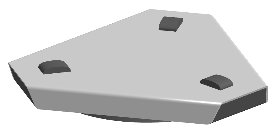
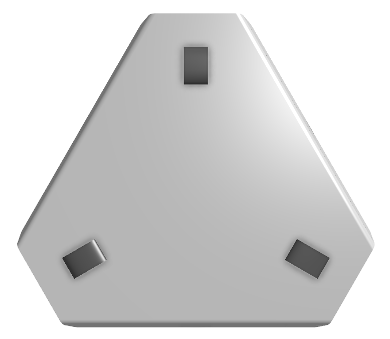
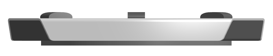
This is pretty close to the basic starting shape, but with the outer edges angled either in or out. I ended up liking the mixed option the best, in which the short edges of the hexagon platform shape are angled out and the long edged are angled in. It would be pretty easy to make out of two pieces of sheet metal (one on top that bends down on the long sides and one on the bottom that bends up on the short sides).
I rounded the tops of the three lifters and really liked how it looked, so I’ll keep them that way for the rest of the sketches. We may need to modify them later for functionality or manufacturing, though.



Design Path 2: Flowing edges
I wanted to see what it’d look like if the sides flowed up over the edge onto the top surface. It’s kinda neat, but I wasn’t excited enough about any of the variations to pursue them further.


Design Path 3: Rounded + Layered
This path would prohibit normal sheet metal bending, since bends can’t easily be made in anything bus straight lines. The rounded corners would only be easily made using stacked-up layers of sheet metal forming the outer walls of the platform. There’s some opportunity for interesting designs using these layers.


Basic 3D Modeling
The goal with 3D design is to flesh out each of the two remaining design paths (angular and rounded/layered) enough for us to decide which features we like about each, and ideally to decide what we want to move forward with.
Angular
Rounded
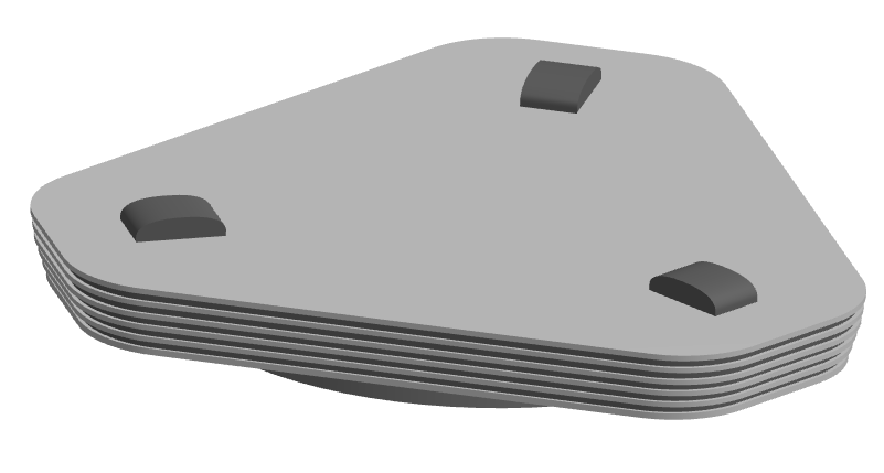
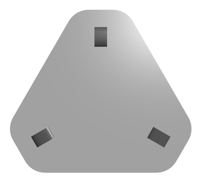

User Interface + Stability Panel
It was super cool to see the sketches come to life in 3D, and got even better once some details for the user interface and stability panel were added. This is a good approximation of what the final product would look like, other than the small details. A
Angular
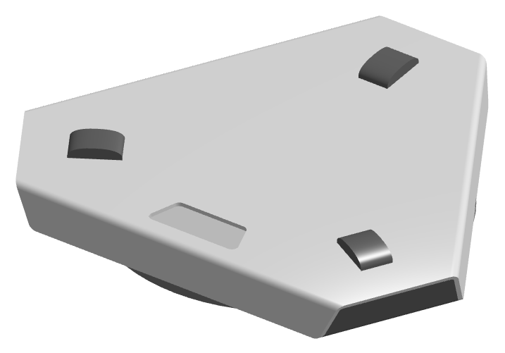
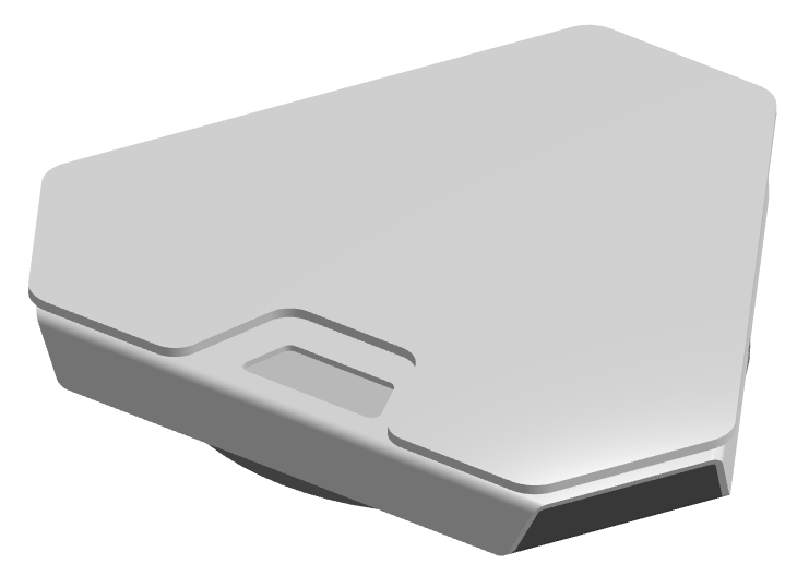
Rounded
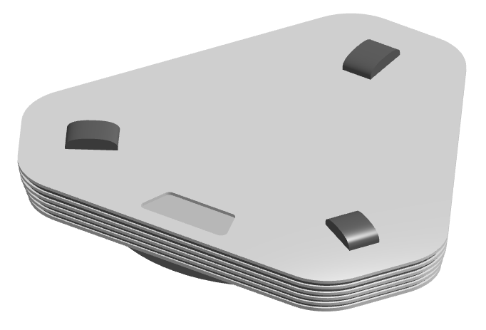
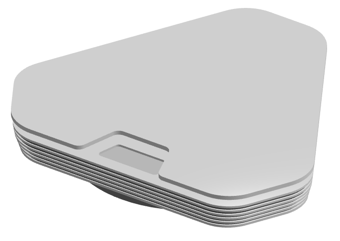
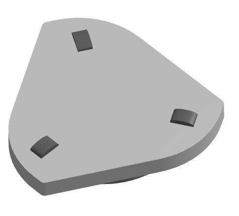
I did try a few combinations and other experiments in 3D, like a layered version of the angular design and a much rounder version of the round design. Plus this wavy asymmetric shape. It’s always worth testing weird ideas to try to find interesting design elements, but there are always some duds. Still fun, though!
Final Choice
I ended up deciding to go with the angular design. It’s simple and cheap to manufacture, should be very structurally strong, and I just really like how it looks. Further tweaking will definitely be required as we work more on incorporating all the sensors and moving parts, but this will be the starting point.
In the next entry we’ll be continuing with the aesthetic side of this and working a bit on the user interface!
Thanks for reading!