Journal Entry #8: User Interface
The whole idea of this project centers around designing the platform to be as automated and hands-off as possible, so it’s reasonable of you to ask “well, why would you even need a user interface?”
The answer is three-fold.
First, there’s always a risk of errors occurring (especially during startup). There has to be some way to alert the user that something is wrong, so they can fix the issue, reposition the platform, or restart the system.
Second, There needs to be a way for the user to tell when the platform is finished its startup calibration sequence and ready for the telescope to be used.
Third, most of the time the platform will be moving too slowly to see. There needs to be some way for the user to tell that it’s still powered up and tracking the sky.
And I’ll actually add a fourth point. It’s cool. A little user interface would just be cool. And I already have some ideas I want to try out.
Requirements
The relevant requirements from journal entry #1 are:
Must operate in normal circumstances with no manual set-up other than powering on/off
Must not include any always-on lights
Must have easy-to-understand user interface
Must look good enough that I want to use it
These are great high-level requirements, but in addition to them there’s quite a bit of information I want to convey to the user in the simplest format possible. There are four individual systems I want to give the user information on:
Tilt sensing
Compass sensing
GPS sensing
Overall sky tracking
For each of these four systems I want to be able to convey three statuses to the user: calibration in progress/wait, good-to-go, and error occurred.
In addition I want to show the user how much battery is left, and whether the platform is even turned on.
Overall Interface Idea
The “must not include any always-on lights” requirement is a doozy since pretty much all modern interfaces rely on light to convey information. It makes sense though, since this platform will be used in dark areas to help see the faintest stars. Any extra light will ruin the user’s night vision.
There are three basic solutions I can think of. Option 1 is to use an lcd or e-ink screen that doesn’t have a backlight. This would actually be pretty great and nice to look at, but it might be more complicated and feature-rich than we need. The user could just shine a flashlight at the platform to read the system statuses.
Option 2 is a mechanical system that moves indicators via motors or solenoids, but that’s absolutely overcomplicated. Any unnecessary moving parts add risk of failure, which isn’t worth it when other solutions exist.
Option 3 is to use lights like LEDs as indicators, but pair them with an ambient light sensor. So normally the lights would be off, but when the user shines a flashlight at the interface just like in option 1, the lights turn on (only as bright as they need to be) and linger on for a few seconds before fading back off.
I’ve been thinking about this for a few days now and have been torn between option 1 and 3. I’ve used e-ink screens before and they’re super cool. You can make beautiful interfaces with them, they’re super low power and relatively easy to use, but I just keep coming back to the simplicity of LEDs. In the industrial design I ended up leaning towards minimalism, and I think I want to keep that trend going. This platform should be as unobtrusive as possible, since it’s just a supplementary product to the telescope.
The biggest tradeoff I anticipate is a lack of detailed error messages if something goes wrong, so if that becomes a significant issue we’ll reevaluate in the future.
LEDs + an ambient light sensor are the way, for now.
Interface Structure

The simplest option would be a grid of LEDs, four rows by three columns. Each row would correspond to one of the four systems mentioned above, and each column would correspond to a status.

I also need to figure out how to display battery and whether the platform is on or off.
On/off is easy; I can just use a toggle switch as the power switch, so the user can see which side is toggled.
For battery, I think it’d be nice to continue the LED grid and add a fourth column showing the battery level. A 4×4 grid feels nice, and I might be able to design some neat startup LED sequences with it.
Icons
I’d like to avoid that much text on the platform, so the next step is to design icons for everything. We need seven:
Tilt
Compass
GPS
Tracking
Wait
Good
Error
I’ll compare a few options for each before deciding which to go with.
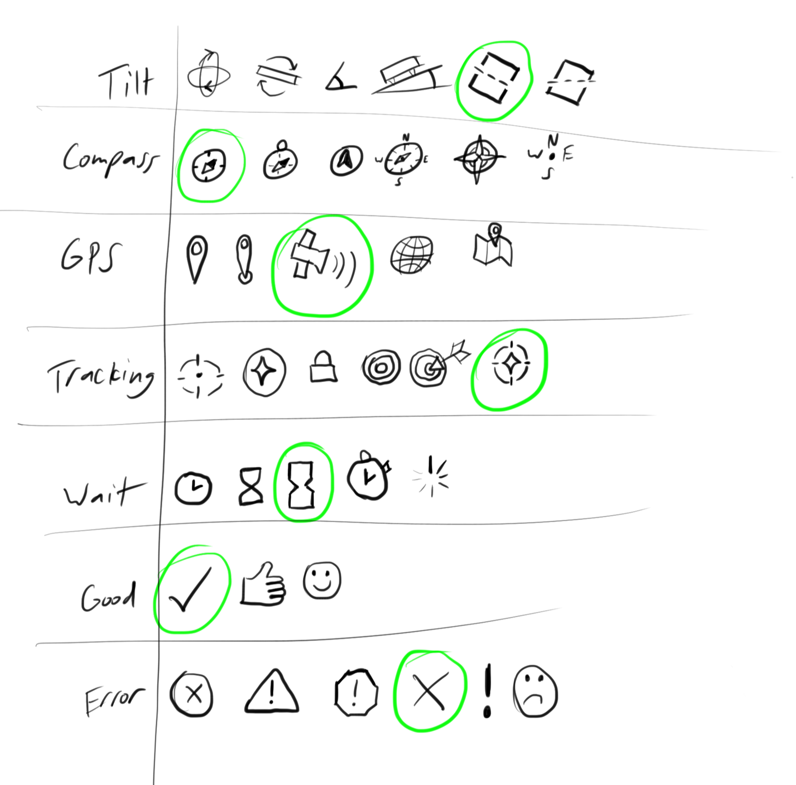
I ended up choosing the options circled in green because I thought they each did a good job of simply conveying the proper information, while at the same time looking good together. Before landing on them, I tried a version where each icon used the round version (notice in the options image that there happened to be round options in each row) thinking it’d look cohesive:

In my opinion it just looks overwhelming and confusing. I like this final combination a lot better. There’s a lesson there, I think.

The last step was to design them in an actual graphic design program. This was my first time using Adobe Illustrator and there was a learning curve, but it was fun to learn and I think they came out nicely!

Putting it all together
I’ll still need to find a proper on/off switch (which would be where the black rectangle is in the image below) and I want to come up with an actual logo for Outer Bound Studio, but here’s a placeholder interface!
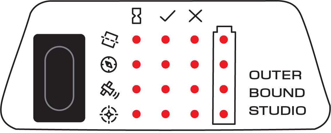
The LEDs will actually be red in the final product (assuming we go with LEDs) since that’s the color that has the smallest impact on our night vision. That’s why you’ll often see people using red flashlights and head lamps when using telescopes or even sometimes when just camping.
The final missing piece will be the ambient light sensor. I think this can go in the bottom left corner next to the on/off switch so it doesn’t distract or confuse the rest of the info.
Oh and there’ll also need to be a USB port somewhere for charging, programming, and reading data. That might need to be somewhere within this interface if I can’t find a better spot, but that’s a concern for future-me.
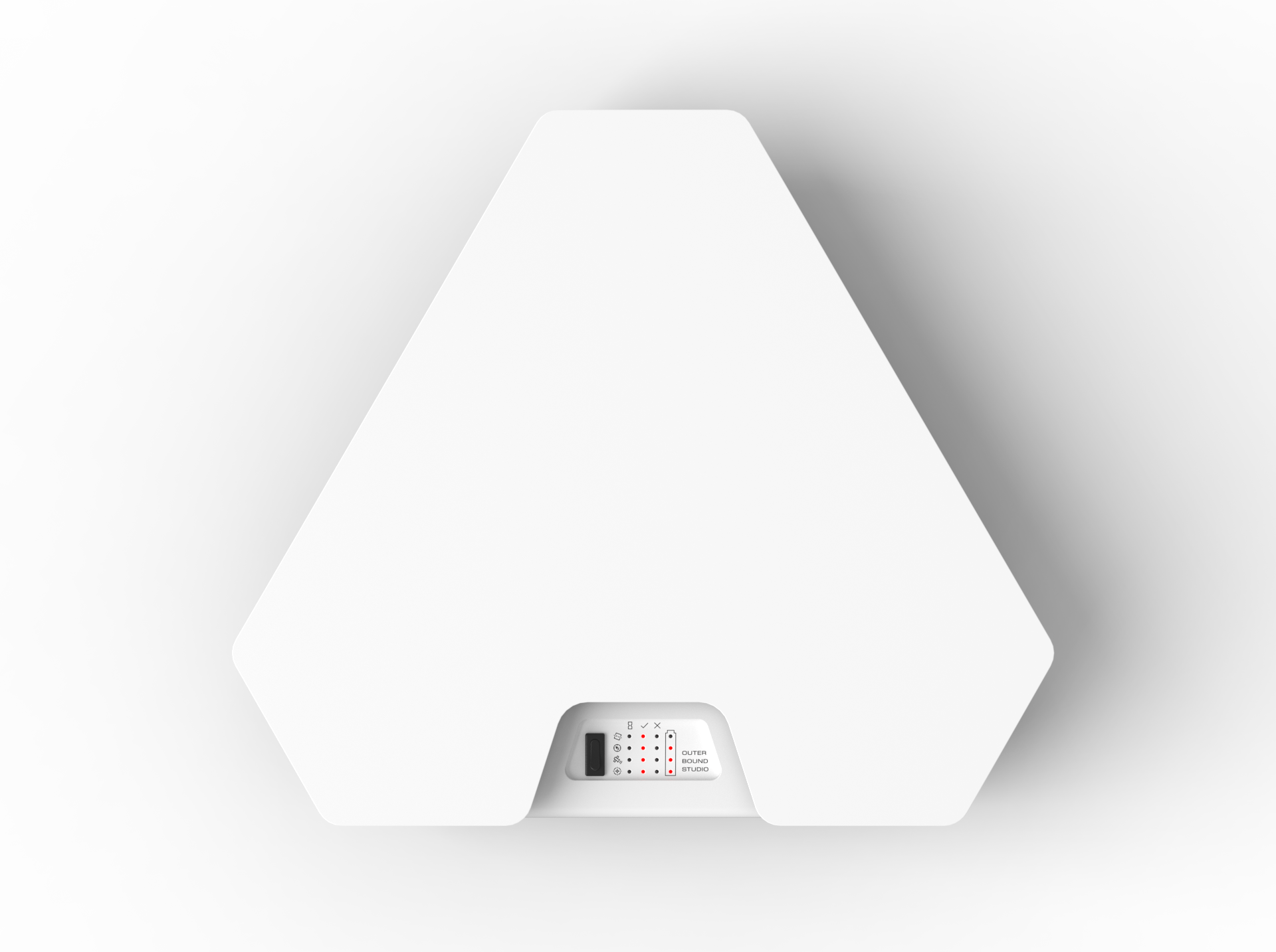
Cool Product Renders
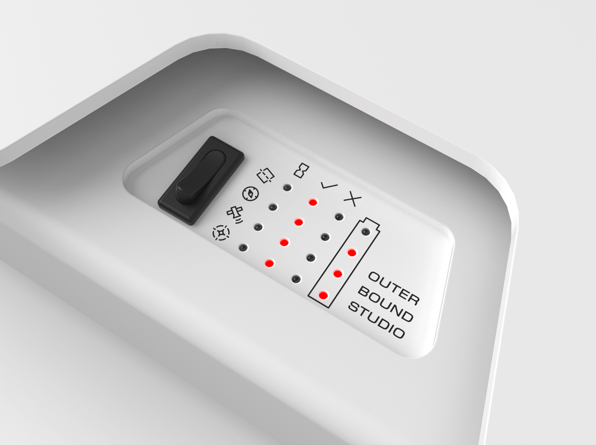
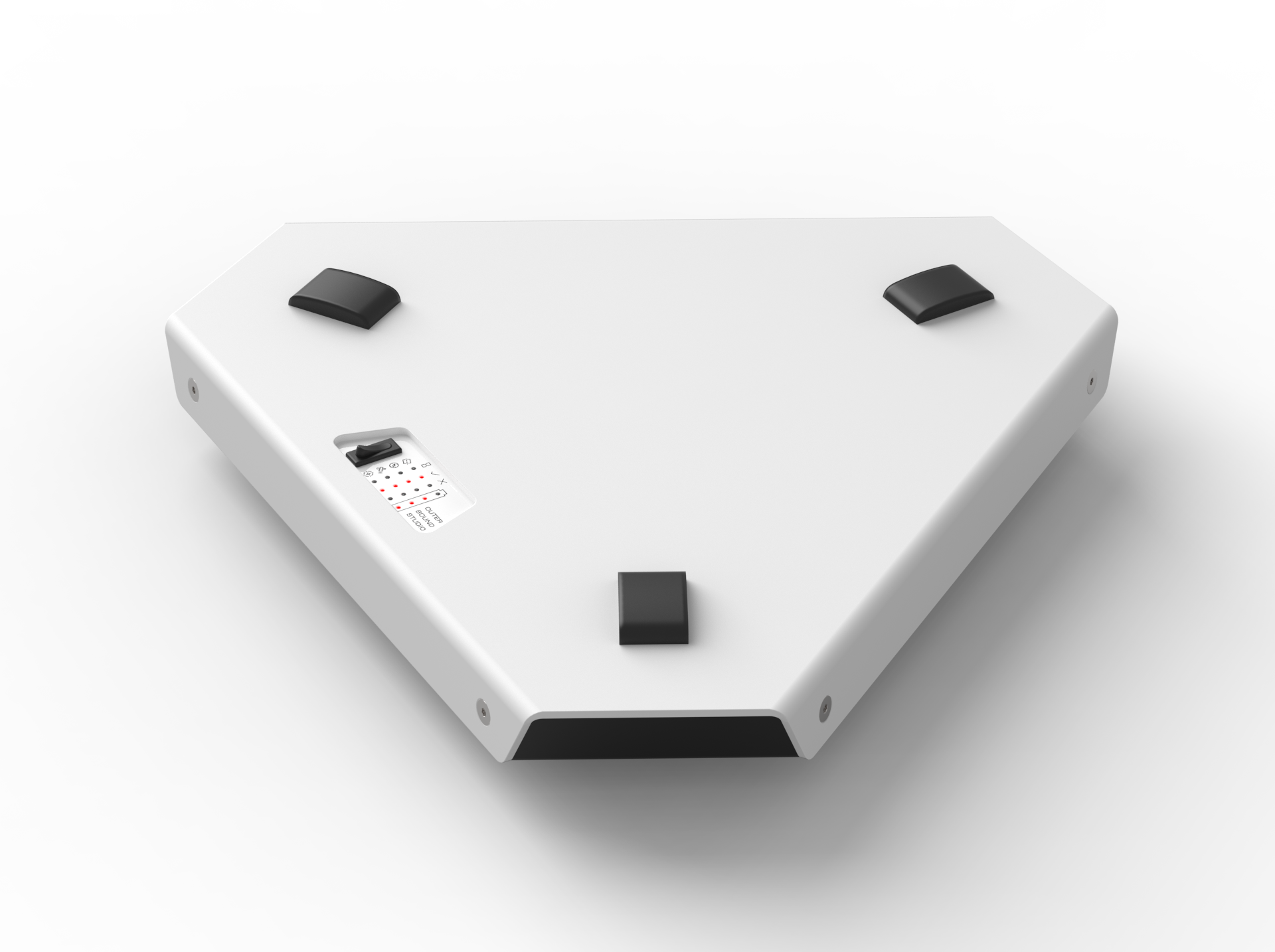
Technically the user interface should be one of the last things designed for a product like this. I decided to do things backwards mainly because I was excited to see what this platform could look like when it’s complete. Let me tell you, it was worth it. I love the way this is turning out so far!
What’s next?
In the background I’ve been playing around with some motors, sensors, and other electronics chosen based on the earlier journal entries. The next entry will be about these experiments and the first basic prototype! We’re making progress!
Thanks for reading!